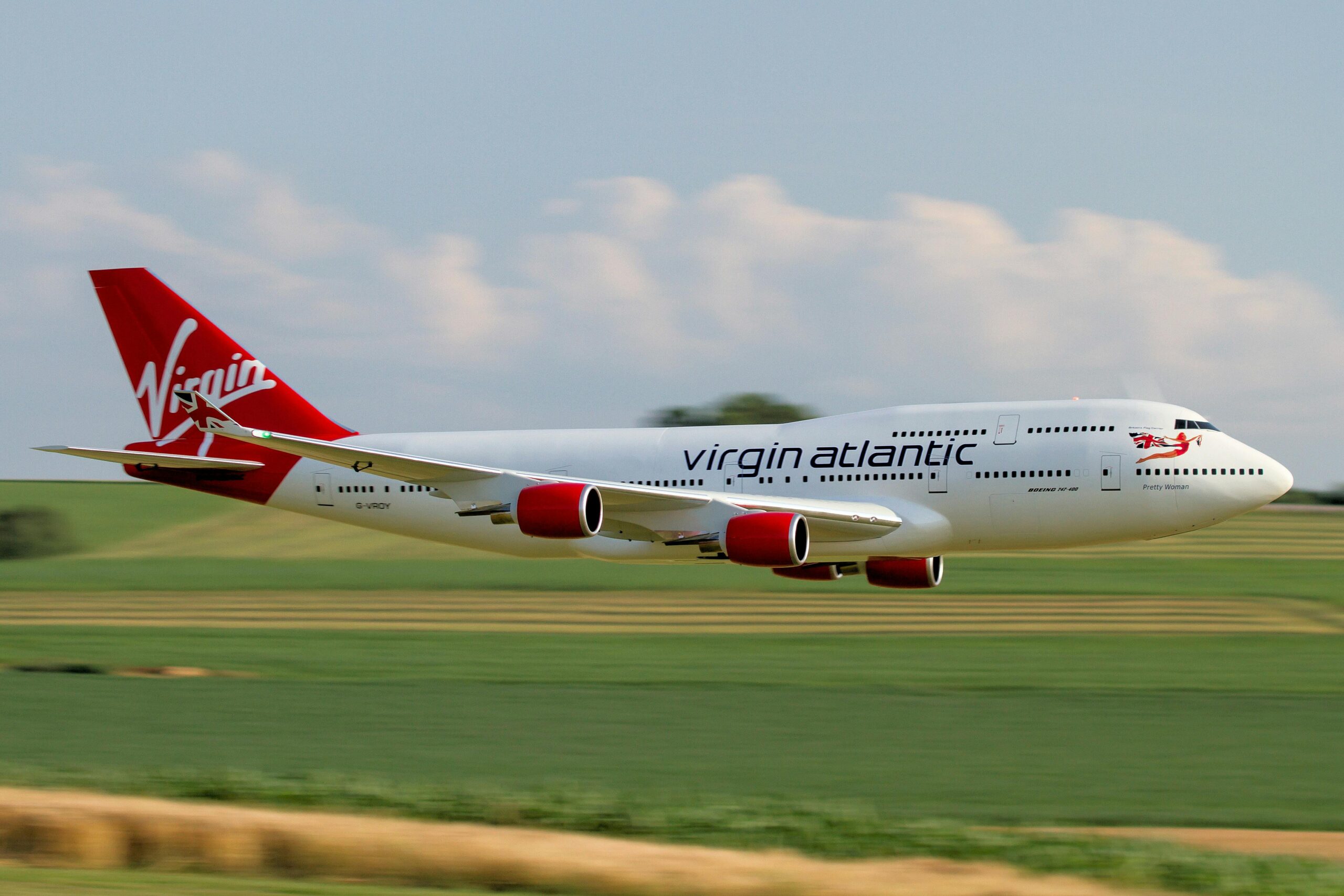
Branson. Not the pickle. The slightly weird mop-headed, bearded fella. The bloke who set up a record company in the seventies, then the megastores, the airline, and the rail group. The same man who founded the mobile phone company, the space-tourism company, the soft drink, the comic animation group, the health bank, the wine, the actual bank, the clothing, the hotels, and the care homes. Busy man is Branson. He gets around.
Branson has been accused of being an expert of self-publicity, and to a certain degree he is; appearing in every photo shoot, TV snippet, and space launch, and yet the success of his many, many, many companies is far more simplistic than that. Virgin is a perfect example of how to build an iconic visual system. You don’t even need to think about it. Always the bold red. Always the same typography. Always the same placement. That swish at the bottom which underlines the brand. It’s as recognisable as the half-eaten Apple logo, the McDonalds arches, and the weird green Starbucks lady. You know, other global brands that understand visual systems.
This isn’t a study of brands, guidelines, or design properties. It is about a consistency across multiple markets that makes a product instantly associate itself with another within the same group, Think about Braun. Whether it’s radios, food processors, shavers, or record players, the logo is always in the same place, on the same colours, in the same material. It’s minimal, but that is what the brain wants. A subtle yet simple way of producing the cognitive response that ties one thing to another. The brain navigates intuitively without conscious effort.
Think about it another way. Every time you miss that visual touchpoint you weaken the brand and customer trust, because you have to take time to mentally join the dots. Imagine walking into a McDonalds anywhere in the world. Now imagine that the staff uniforms are variable, and the fries are in different holders, or that the Big Mac has the lettuce in a different part of the burger structure. You’d be sitting there (quite rightly) questioning where you were. It might only be a split second, but that’s all it takes. Multiple that fleeting feeling by the sixty-nine million people that eat at McDonalds every day globally and you have a company that’s lost a fraction of its superpower, which when valued at 213 billion is a lot of money.
It seems so simple, yet pulling together all of the visual elements; the colours, typography, copy, photography, into one cohesive and consistent language really is the strongest way of creating a strong identity. When we talk to clients about what they want, it mostly comes down to a memorable brand with guidelines to work from, maybe even a website. What they often mean is that they want a strong visual identity.
If you are serious about being recognised, and you’re wondering upon reading this if your visual identity is strong, you probably need to stop winging it. You need a proper visual identity system. One that joins the dots for your customers before they even realise there are dots to join.
I am Simon Carlo, a food blogger, journalist, copywriter and bonafide mild child. The above words are mine. Mostly. The gooder ones anyway.

